How to make a monster research site a pleasure to use
When the Our Land & Water team knocked on our door, they had a sticky situation to solve.
Their mission is to preserve Aotearoa’s most precious treasures, our land and water, balancing the protection of these taonga with the needs of our community.
They help New Zealanders work together as guardians of our land and water. And they grow public understanding of land and water science and the principles of kaitiakitanga.
They also administer a research budget for the New Zealand Government, funding research to accelerate science to improve our land and water for the next generations.
This is critical work, that serves all New Zealanders. Our Land & Water are pretty rad. But they had a real headache.
All this research and all their resources were stored on their website. It’s a critical library for scientists, agricultural researchers, and farmers.
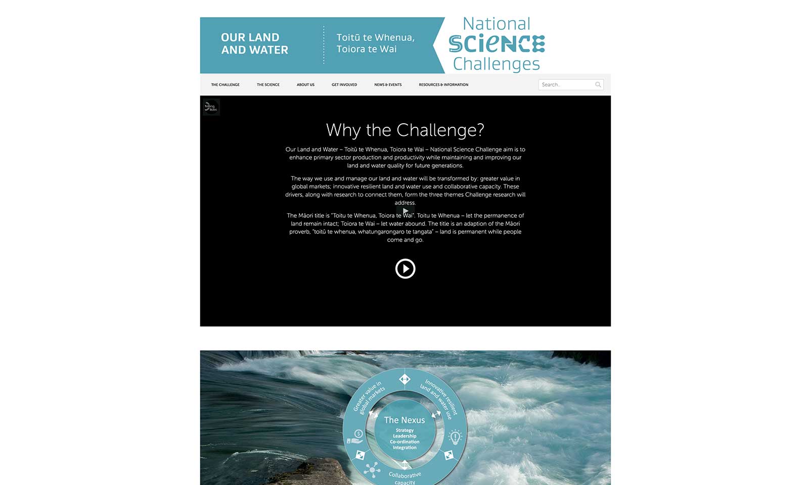
But it wasn’t up to the job. People couldn’t find the content they needed.
When we popped the hood, we could see why it was all going so wrong.
All the documents were stored as pdfs. Nothing was available to search. And the website structure was outdated. It was a proper pickle.
So, we rolled up our sleeves and got stuck in.
Taming the beast
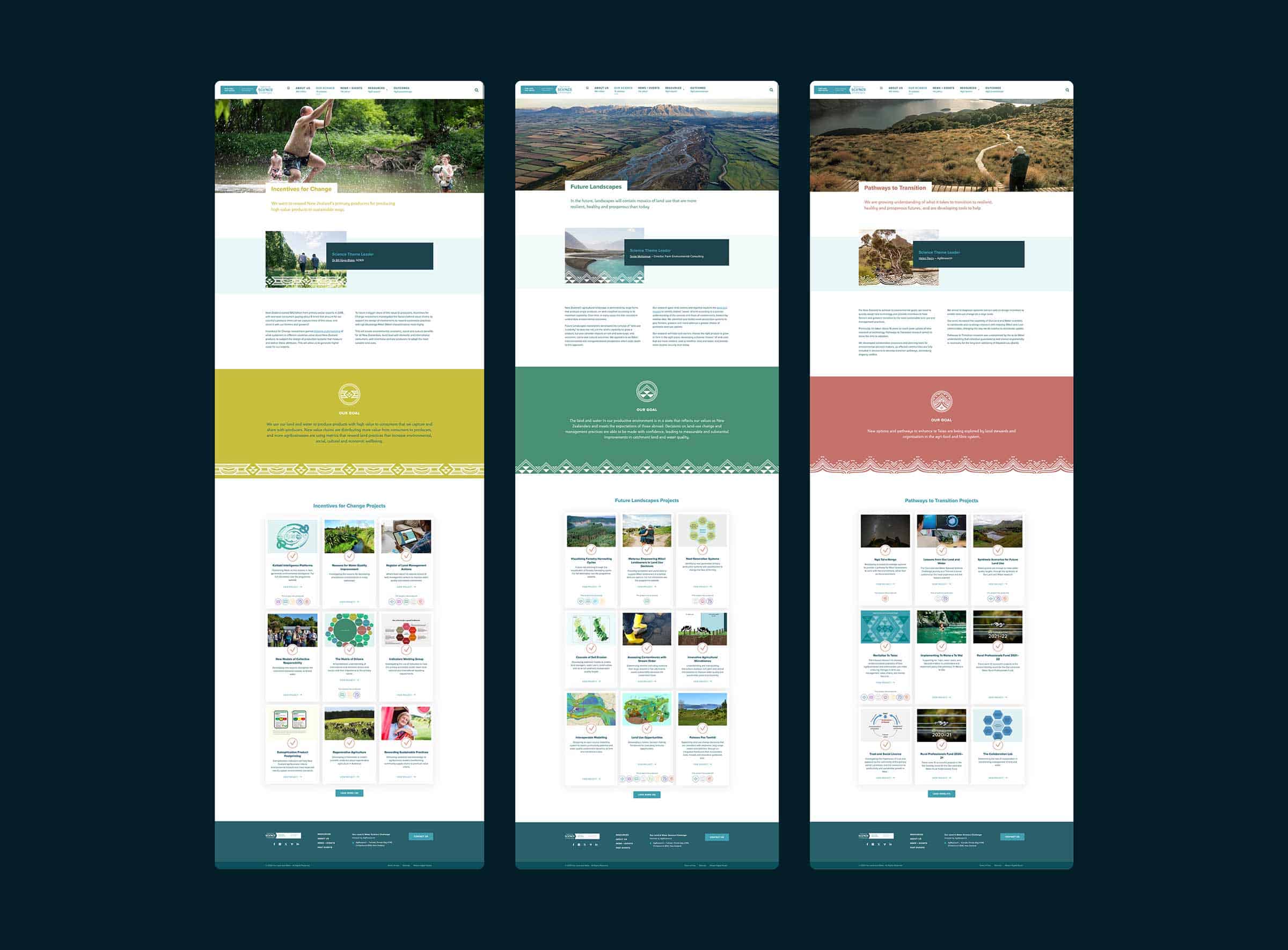
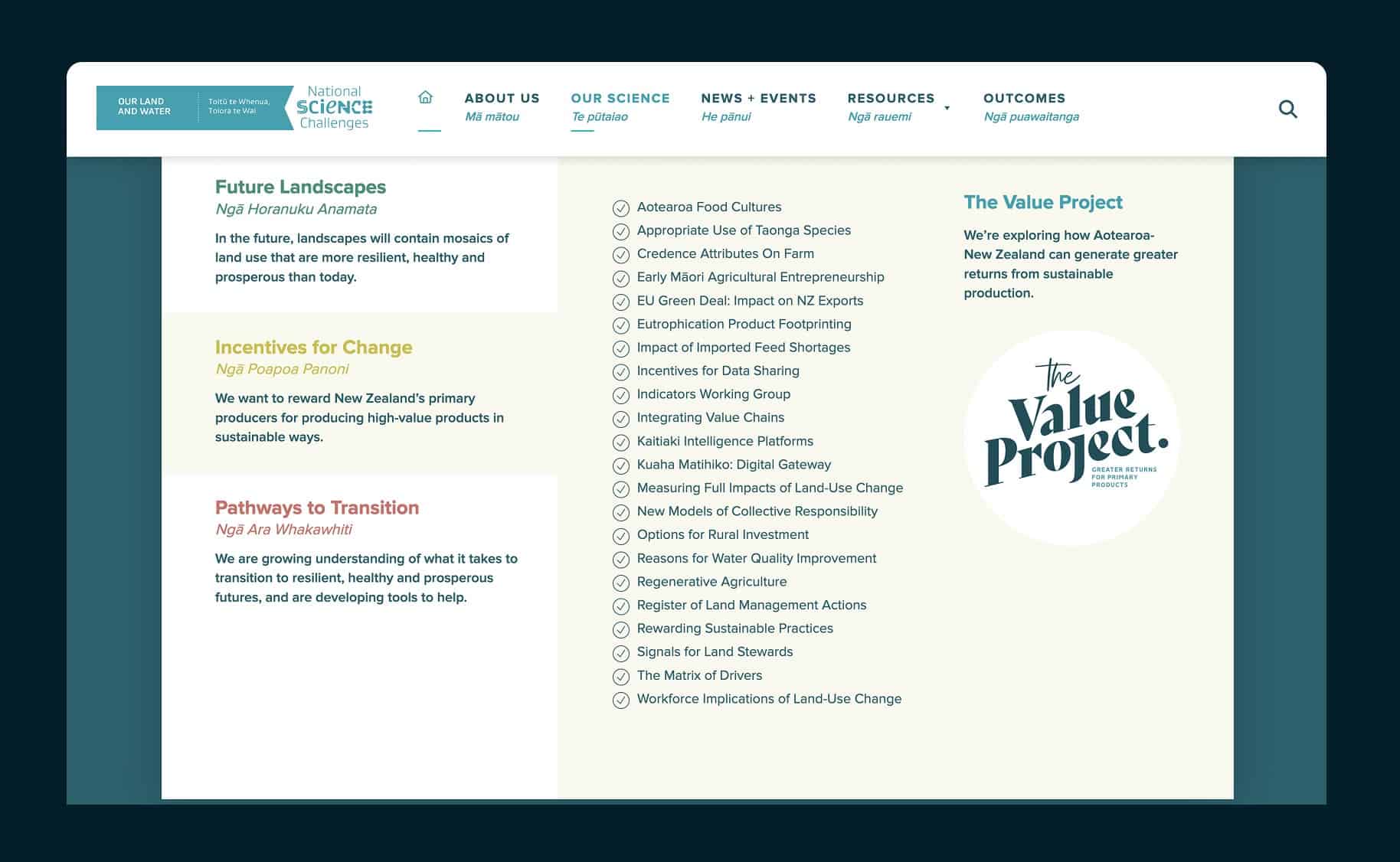
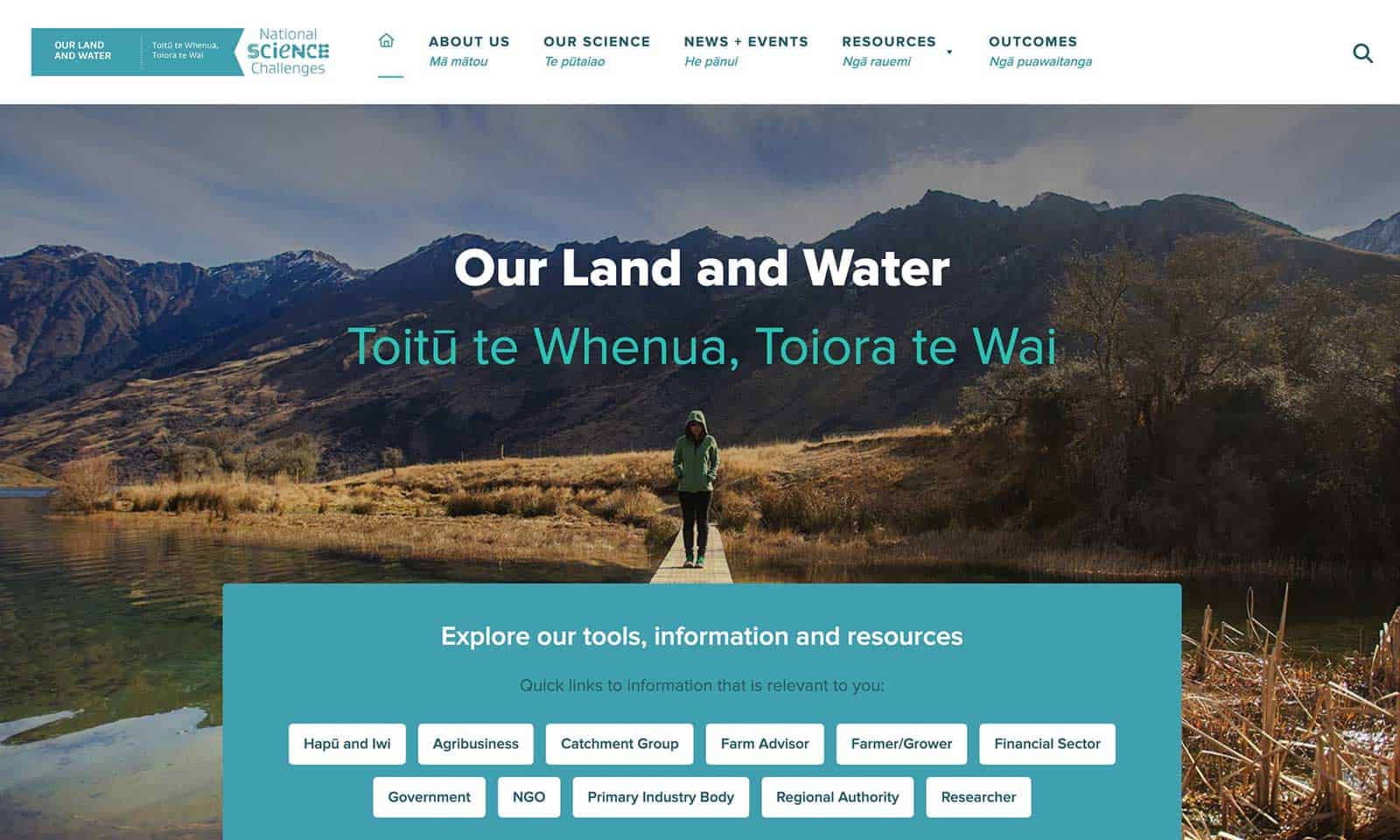
We were looking at a massive job. Hundreds of pages of content to be sorted, categorised, and uploaded to a new content management system, where they could be filtered and searched. Search criteria included topic, author, contributor, and research project.
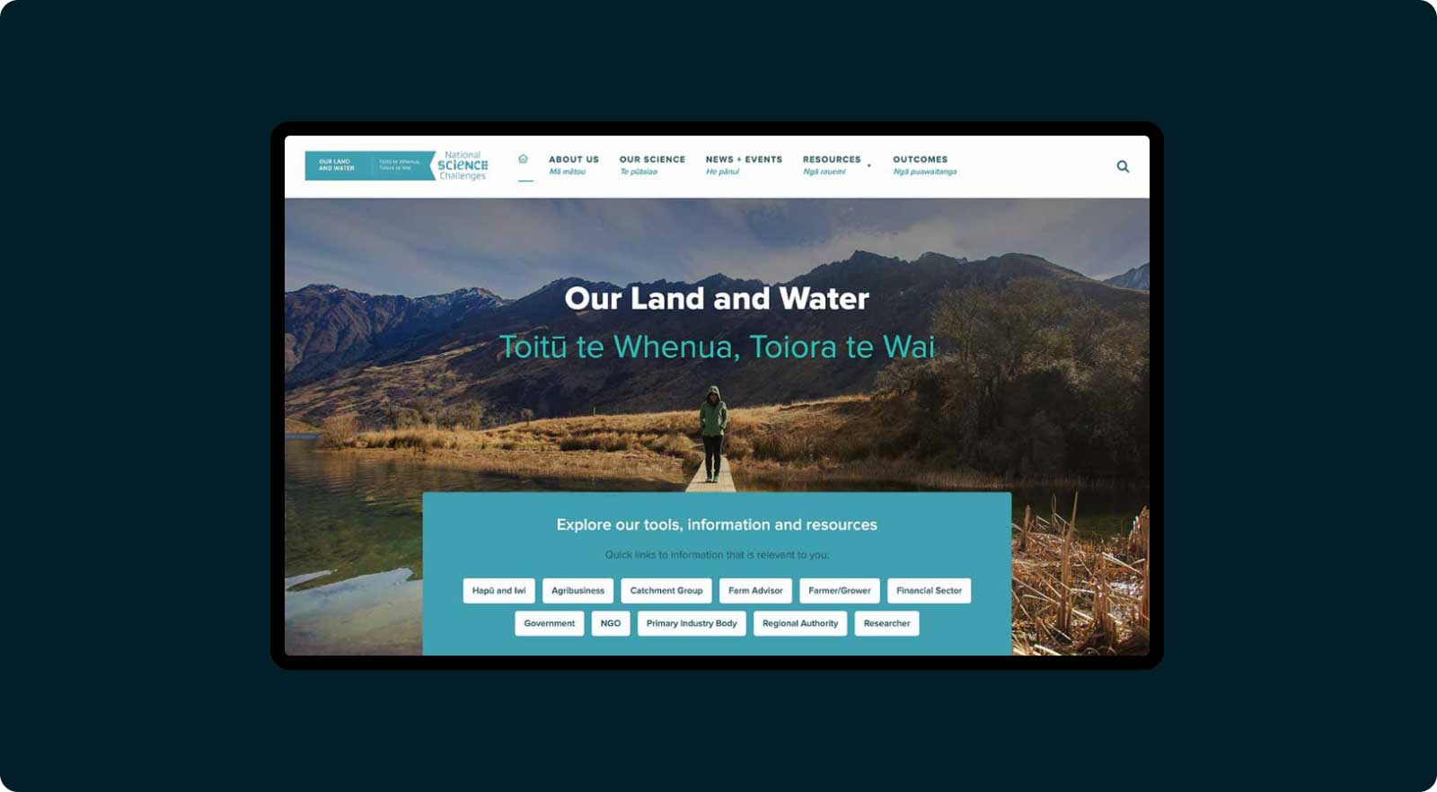
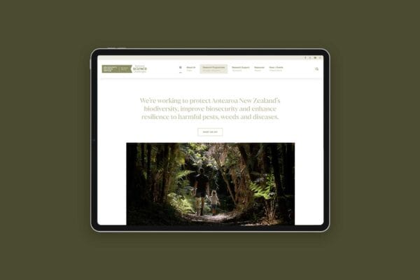
As well as making their website into a robust research resource that’s quick and easy to use. The Land & Water team wanted their new site to showcase spectacular imagery and be attractive and enjoyable to explore.
Annabel McAleer, Senior Communications Advisor at Our Land & Water, explains why she chose Weave for the job.
“Before I joined Our Land & Water, I managed a website Weave created. I was impressed by their responsiveness and care – so when I needed to create a large new website from scratch, I knew I had to ask Weave to quote for the job. At every stage of the process, I’ve been so pleased and relieved to have the website in Weave’s safe hands.”
The complexity of simplicity
It’s tough to take a very complex thing and make it simple.
An Italian dude called Leonardo da Vinci once said: “Simplicity is the ultimate sophistication.”
We don’t know if we’re sophisticated but transforming clutter into clarity is one of the things we do best.
Our goal was to make Our Land & Water’s content visually interesting, accessible, digestible, and easy to find. The site also needed to be simple to use for their visitors and easy to maintain for Annabel and her colleagues.
The design process was painstaking. Because of the quantity of content, we produced detailed wireframes showing how the site would be structured.
We reworked their filing taxonomies to categorise their research and resources. We knew that their library would continue to grow, so they needed a robust structure that could handle this.
We tried to map out every possible scenario, all the possible searches, and combinations of data that might be presented to the site. It was all about future proofing and ease of use.
Once we’d planned the website structure, we moved into creative design.
Because of the important work Our Land & Water do, they have many stakeholders. We still remember the day we came to present the design options, and walked into a room of 20 people with expectant smiles.
Fortunately, we hit the mark. Annabel says:
“The design options for the website were presented incredibly clearly, so the decision-making process was easy. I find our website extremely easy to use, and after 18 months I’m still happy with the design.”
Websites for research organisations are our thing
When we took it on, this project was the most content heavy website we’d tackled.
But we realised that we loved the process of taking mountains of information, ordering it, and presenting it in an appealing way.
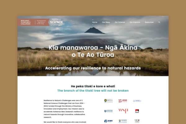
Because the Our Land & Water team were so happy with their new website, they recommended us to other research organisations.
Creating sites for research organisations is now one of our specialties.
Annabel explains why she likes working with us.
“What makes me recommend Weave unreservedly is their maintenance of our website. It’s so important to think beyond the design and build to the ongoing relationship with your website managers. It’s a long-term working relationship that can be unexpectedly expensive and stressful in the wrong hands.
“Weave excels in responsiveness, clear explanations, and creative, quick solutions. They’re an absolute pleasure to work with. They have reasonable rates for maintenance and updates – I’ve always known exactly what to expect and I’ve often had my expectations far exceeded!”
If you’ve got a complex website project with a truckload of content, we’re your team.
Get in touch and we’ll talk taxonomies!